Thursday 9 May 2013

OUGD406. Design Practice. Speaking From Experience.

today we were introduced to the third part of the Design Practice module. the brief is a live brief that will be presented to next years first years at the start of that year.
dont do it about staff.

Produce a graphic response/graphic product/piece of work that makes a statement, comment, observation or gives advice about your experience on your first year of this course.

the point of the brief is to consider how my first year has gone: what i have done well/not done well, what i have enjoyed/disliked, how i have become accustomed to student life/struggled living independently.

the brief is asking me to come up with some way of improving or making easier one or multiple aspects of uni life that i had difficulty with/feel i could have used some advice on.

i began by looking at the brief and its basic requirements and general advice and began to highlight and consider the main points and what spoke out to/interested me in terms of a potential path to take in resolving the brief.


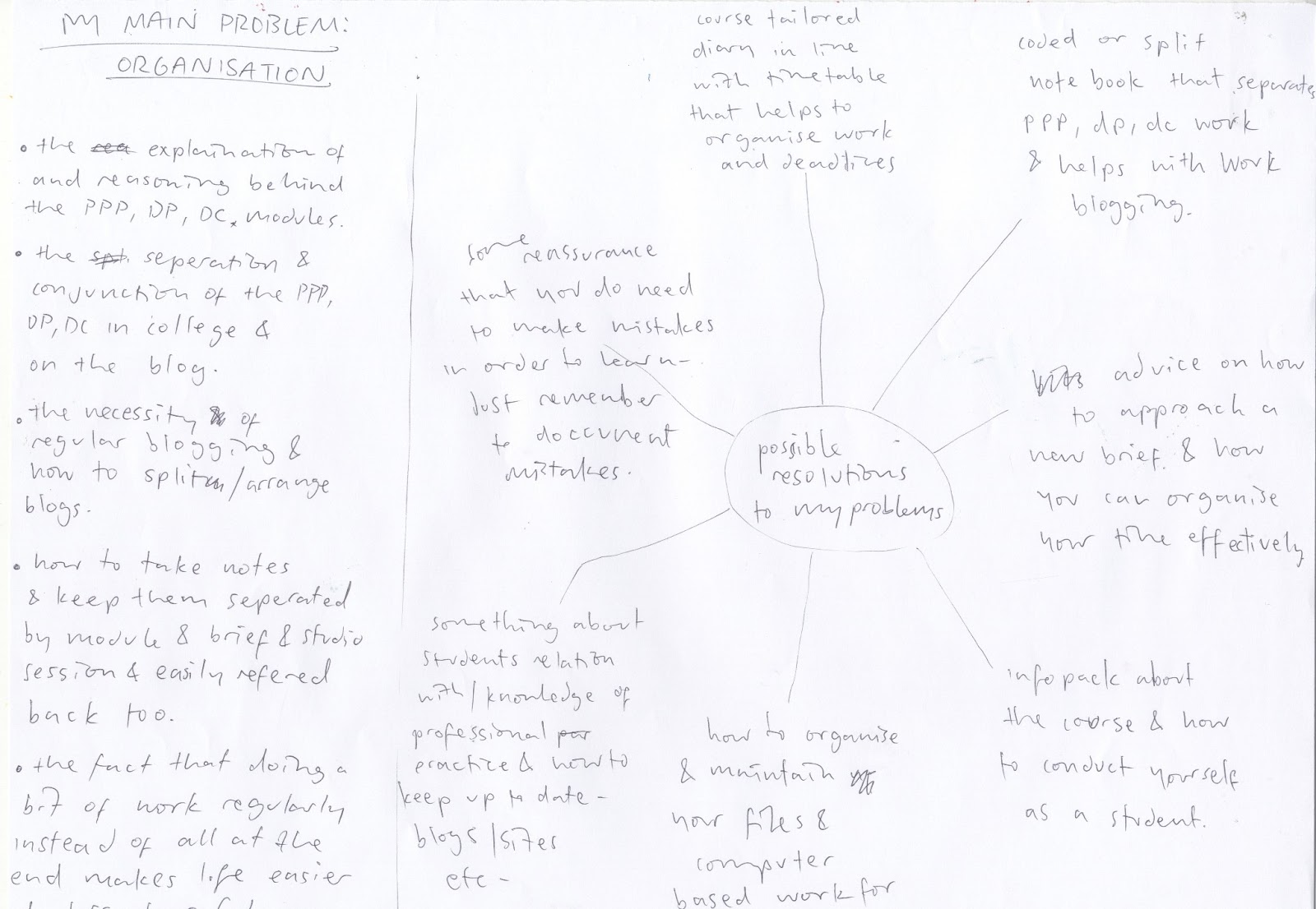
having read through the brief a couple of times to gain a basic understanding i then went over and just picked out the main points of interest without any real thought as to why. the blue lines indicate the more appealing ideas all of which are aimed at giving advice and helping to assist people in their learning process

so from this general idea of what i wanted to achieve (advising/helping new students) i thought about all the main problems i had incurred at the start of the year and what things i would have appreciated being told about. for example; i had some difficulty in understanding the module splitting and the relevant blog sectioning. i also didnt expect the levels of commitment and organisation required and feel these would be good things to know as a new student.

from these initial thoughts i went on to concentrate the number of ideas to a few main ones of which i was most supportive and interested in. i considered how i did cope and what methods i used to get myself used to these new things. i then thought how these resolutions could be translated into interesting and useful graphic products in support of new students. i wanted to maintain the aim of assisting and advising but make my resolution engaging and new so the audience might be more attracted and committed to my outcome(s).


i wanted to get down some initial thoughts based on my intuition and before any research and so i considered some basic resolutions to the brief: how they might look, function, be successful/useful. these initial sketches were helpful in giving me a visual representation to my basic ideas in order for me to then improve on something.


having considered these areas and forming a basic idea for a possible project and solution we were asked, as a class, to re-group. we were each given a concept sheet to fill out to have a more formal plan on record. from this we were each asked to stand up and present our initial ideas in short to the class. i was happy with my ideas and felt quite confident from peoples reactions. 


i want my product to be accessible, useful and informative about the course in a way thats understandable to new students who dont know about it. due to the fact that we had the choice of working in a group or alone there were aspects of the fill-in regarding peoples roles and responsibilities within the project. because we recently finished the communication is a virus brief, and that was a group brief, i decided i wanted to work in a different way and consider all aspects on my own and so am working alone. i feel that i will be able to achieve a more personal connection to the cause of the brief and so should be able to produce more focussed and successful graphic responses in line with my aims.


for friday we were asked to each produce 3 idea boards to communicate our project ideas. one about my concept, one detailing potential or attractive methods of delivery, one regarding the production of my solution.


in the crit we were each asked to provide feedback on our ideas and write it dow on paper below.


i think the crit was really useful in telling me straight that my idea was overly ambitious, unrealistic and not really appropriate to the brief. so then i went back to the design sheets and re worked my ideas.


having a more concrete idea down i then went on to do some logo designs.


i then went on to make some mock layouts for each page of my designs with which i used as a template to design my final product.


Wednesday 8 May 2013

OUGD406. Design Practice 1. Communication Is A Virus. 10,000 Steps.

we were introduced to the new brief for design practice communication is a virus. we were split into groups (i was with bobby, lizzy, tristen, barney, and jake) and given an initial briefing about the project. each group was given a concept to work with and we got '10000 steps'. from this initial point it was up to us to consider the direction, audience, content, tone of voice and produce via in depth research and visual exploration.

we began by considering everything we could think of to do with 10000 steps prior to doing any research so we had completely innocent ideas to then proceed with.


i thought about quite a few different directions the project could take but most of them could be considered tenuous or somewhat unrelated. having had some time to go over our initial ideas we decided that we were going to base our topic around the idea of doing 10000 steps per day to maintain a healthy lifestyle.


having done some initial research we regrouped and presented our individual possible themes for the project with which we then chose 1 to go forth with. everyone came up with interesting ideas and my main idea was surrounding totalitarianism and the aesthetics/tone of voice of dictatorial propaganda. because we were a bit rushed at this stage we decided to go along with my idea without really considering it in depth and in relation to the aims of the brief.


in preperation for the first crit we were asked to come up with a propsal for our project, thinking about our message, tone of voice, intended audience and aims for the project.


i wrote this in line with our initial idea and then we had our crit with amber which is on my ppp blog. from the crit we realised that my idea was quite irrelevant and without connection to the theme of 10000 steps. i was really glad for the crit because i feel as though our initial idea was rushed and too 'off the top'. so we regrouped post crit and put our heads together to think up a new theme for the project.

i decided to completely restart and did some idea boards and mind maps to visualise my ideas so that i could then manage and evaluate them and find the most appropriate one.


from this re-think i came up with a number of new potential ideas as did the rest of the group and when we came together to present we were much more informed and prepared. we ended up deciding to base our project around a motivational guide/pack to get people to walk 10000 steps a day and provide an explanation of why its important to aim for this.


having established our theme and aims the next step was for us to re write the given brief so it is more tailored towards our aims and ideas. i was allocated the task of rewriting it. i started by considering a mock brief with the basic points we wanted to include and then i wrote it up formally into a brief template on word.


we then went on to consider the incentives of walking 10000 steps and how we could motivate people to do this along with possible ideas for graphics, production methods, colour etc.


having considered our theme in more depth i thought it necessary to design a logo to represent and promote our project. i wanted to do something in line with 10000 steps and with the name 10000 steps and so i made a few initial sketches, mostly typographic. 


i was quite happy with a few of these designs but i presented my ideas to the group and everyone was most keen on the shoe idea in the bottom left corner so i decided to develop that further as our project logo. i redrew the logo in better and more accurate quiality and then put the image into illustrator and used the pen tool to digitally trace it. i left it black and white at that point because we werent sure about the colour scheme at this point.


we decided that we would base our content around infographics because this is the best and most interesting way of visually explaining all the different aspects of getting 10000 steps a day. we considered some other things we could include to distibute and communiate our ideas. our main aim was to establish and promote a route around leeds that would get you your 10000 steps while also taking you round the main places of interest in leeds city as this is the city were in and where our target audience is based. we came up with 6 main aims for our infographics and project and then split them up so each of us got one aspect to design an infogrpahic around. i was given the route to research and design. 

from this i began to digitally contruct my initial infographic design using illustrator. at that point some of my content was lacking and i had not finalised the route so my designs are quite limited and basic but i was aiming to look more at the potential layout of the infographic and how things would work together or not.


i then went on to create a route on google maps that gives you 10000 steps and i made it public so that anyone can access and search for it on any internet able device so its accessable:


from the second crit we realised that we needed to get more viral and so we created a facebook page and twitter page to communicate to poeple and get their feedback. we also linked the two to each other and the map to both so people can access the map though the social networking sites.


from this i went on to redesign my infographic and include the final revised route as part of it. i went back into illustrator and started again from scratch but using the original as a layout and composition reference.


we decided to use a yellow and blue colour scheme as its a nice contrast that isnt too striking and overly bright.


i started by getting the route i had made on google maps and putting it in illustrator and using live trace to turn it into a vector. then i removed the unneccessary bits but maintained some syrrounding map for reference.


i applied colour to the logo and tristen but the facebook and twitter information on the bottom.


 the rest of the vectors i designed using the pen tool to shape the shapes. i wanted them all to be easily recognisable so i made them simple and understandable.


for the eiffel tower and golden gate bride i used the live trace tool but the made my own vectors over the top in simplified form.


we used the logo to make stickers to communicate our project to people. we also put stickers up at all the major points along the route for to follow.


we each put stickers up around leeds to promote the project. we also decided to design a lanyard held quick look info pack with simplified versions of our infograhics on and with help and information about 10000 steps


we had to do a presentsation at the end of the brief to the class presenting our project and so i designed and scripted one on powerpoint.