Wednesday 30 October 2013

OUGD504. Design Production. Design for Web. Session/Task 2. Getting Started.

Today we had a studio session with Phil in which we were looking at our sites content and what we thought could be our pages and navigation. We were introduced to the idea of having different web pages extending from our homepage and what pwould be appropriate and useful for a particular site. Phil said it was important to consider why our audience would use our site and therefore what they seeked to get out of it. This would help us to identify how we should section the site into useful topics for the user. 


PART 1.
We were first asked to consider what sub topical pages should our website include based on Users needs and relevant to the aim of the site. Phil said we should keep the selection to a max of 5 pages and write down what would be included on each link and it's pus pose for the user. 


I think this exercise was useful I. Helping me solidify my content which in turn further founded my site theme and aim in line with users needs. 

PART 2 
Having thought about other site pages we were then asked to draw a number of scamps that visualised our homepage and the navigation system and design to the other 5 pages we had considered in part1 of the task. This was useful as well in helping me consider aesthetic and layout for usability. Because my ideas still weren't that solidified I feel as though my designs were a bit without concept guidance but I think scamps are a good way to visually progress with site design. 


I like the heading and navigation menu layout, it's simple but maintains that hand drawn aesthetic. Might be hard to read though. I was thinking about including some sort of animated/interactive link system involving the pens and the users link selection. It's possibly a bit messy and crowded and I would have to consider more about screen resolution . 


I had similar thoughts for this design using the pen line to represent on link and having some sort of drawing animation with the line when the link is accessed. Once again though I think this design is overcrowded and somewhat gimmicky and without justified purpose. 


PART 3 
Having done the first two tasks we were then asked o give each other feedback on our sub page proposals and our scamps and consider each other's strengths and weaknesses. I feel as though I analysed others work well and gave some useful constructive criticism that I really thought about. Unfortunately the feedback I received was limited and only two people actually gave me any which was annoying since I'd given a lot. 

This was nice to know because it reaffirmed my aesthetic which the basics I'm quite happy with but I hav t realised any flaws through this feedback which is what I need to improve. 

This is a good question that I need to keep asking myself I. Order to maintain sense and reason in design. It is unclear from the scamps my exact aims and intents for the website which is important becuSe users need to know what they're on and why. Still though I could have done with some better criticism to consider. 


The session was useful in helpin me consider the Content of my site 
But I was annoyed at how little feedback I got especially when I gave a lot.


Tuesday 29 October 2013

OUGD504. Design Production. Design for Web. Web Design Mac Room Session 2.

today we had the second web session with simon for which we had to bring our scamps (website layout mock ups). these will form the basis for the design and layout for our own website for the brief.

we started by putting our work out and did a quick crit giving each other written feedback on our mocks.


navigation tends not to be at bottom of page because different screens have different res/sizes so viewing on different monitors might not work the same - might make user have to scroll to find the navigation.
navigation should always be consistent thoroughout - if buttons are different on different pages people might not know where to go and they should always remain visible.
splash screen/welcome screen - 'click to enter' - most users will only give 4 secs so to have to press enter might dis sway people to continue.
successful websites are functional and useable but also interact with the audience and can be playful or interactive - consider the synthesis between the two main aims.


from this theory we went on to carry on in dreamweaver working on the site. we started by doing some sketches to detemine sizes and composition of the site. explained most useable and widely appropriate size - 1024px by 768px.
we were given two scamp options (below) and chose option one to work with. we then went on to determine the sizes and specifics of the site contents called the wire frame.


when working in dreamweaver always open files from the local files column on the right.
the outermost box that includes everything in a scamp is called the wrapper (can be called container).
put a space between each setting so things are clearer
the code to any website is completely public - on chrome go view>developer>source code
                                                                       

#DIV - coding


when doing div have to specify measurement working with - px for pixels. can also work in percentages.


can do div id or div class. / closes any div still open.


then we went on to add colour using divs


Monday 28 October 2013

OUGD504. Design Production. Design for Print. Concept Workshop.

today we had the first session about concepts and concept development within design with phil and lorraine.

a concept is considered as a plan or intention. from the latin - conceptum - something received or conceived.

when developing a concept its important to consider a number of things - who is the target audience? what are the clients needs? what is the purpose? will it be aimed at current or potential customers or both?

we talked for a while about how we develop concepts and where we thought they came from in order to then to the afternoon sessions task - in groups we were given 3 pieces of paper - one with a place on it and 3 with things on them.

our group got hotel as our place and match, cloud, and staple as our things.

we began by discussing what we thought each thing was/meant and what was associated with it. to gain a visual understanding we did a mind map for each thing and tried to create as big a relationship between the thing and any links it has.


this helped us to understand each thing by every possible definition so that we were not just stuck on the literal. from this we thought about what each thing could mean in line with a hotel and how a hotel might encompass each thing. we tried to maintain a broad mind to enable us to explore further meanings and gain a wider variety of possible concepts.

having considered each thing in line with a hotel we went on to choose which one to pursure. we did this by vote based on what we thought was most appropriate and best fit the theme of a hotel and after some discussion we decided unanimously that cloud would be the best path to take.

in order to achieve a strong and aimed concept the next step was to determine our target audience. this allowed us to have some focus and be able to design/construct around a target market with specific demands instead of just two words - cloud and hotel.


once again we tried to maintain a broad thought process so we gained more possible ideas. we decided that because the hotel would be based in leeds, and from our knowledge and understanding of general leeds tourism that the most appropriate customer to target would be wealthy, mature professionals and no kids. we recognised that leeds attracts a fair few celebrities and wealthy people and we thought that because there are already a large number of cheap/budget hotels in leeds an up market hotel would suit.


this mind map was useful in defining the hotel to a more realistic and believable extent - to take our concept from a simple idea to a more founded and imaginable one. the left explores the potential inclusions of the hotel while the right tries to define the hotels 'ethos' or delivery. this map was really useful in helping us actually visualise our concept and enabled us to define the hotels identity and aesthetic.

we thought it then appropriate to consider names for the hotel because language and aesthetics are always inter relatable within branding and we thought that having a name at this point would enable us to now become more focussed and work on specifics in order to make our concept more inclusive and realistic.


  • Cloud 9
  • Shade
  • Silver lining
  • Stratus
  • Atmosphere
  • Ozone


  • after quite a long discussion on what name communicated what type of hotel and how the target market would likely receive and understand that name we chose 'stratus'. stratus is a type of cloud formation and so relates in that way. it is also, we thought, the most professional and classy sounding name out of the list because some are quite cheesy and cliche and we wanted to communicate the hotels class and worth.

    we then went on to consider the hotel from a design aspect, thinking what things would be used to communicate the hotels identity and aura.


  • Logos & Signage.
  • Business Cards.
  • Letter heads & Stationary.
  • Restaurant Menu's & affiliated media.
  • Hotel wayfinding.


  • because we wanted to maintain continuity in our concept we thought it necessary at this point to have a founded and relatively concrete idea about the style, aesthetic, ethos, aim, and delivery of the hotel. the most successful brands tend to maintain their identity through continuity and a recognised style and this it what we decided to aim for. we did another sheet that defined these aspects and some of the content of the hotel.


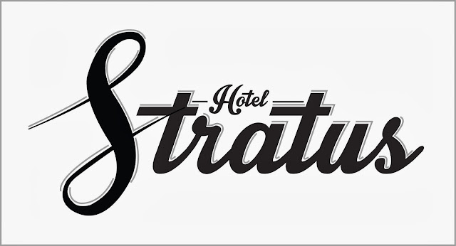
    having a founded style of identity enabled us to visualise the aesthetics more easily and so the next step was to consider a logo for the hotel that would successfully communicate who the hotel was, what they were offering to their clientele, and who that target market was. we each worked on some initial sketches of what we thought the logo could look like while trying to encompass all the aspects of the concept we had established already.


    jordans designs

    roxys designs


    my designs


    everyone came up with some really good designs which gave us a wide choice to work with which is good. in the end we recognised that roxys designs had a basic aesthetic and structure that communicated up market hotel but with a modern edge and so we all progressed with her idea and she put the design in illustrator to create the final one below.


    from the earlier discussion about names and relations to clouds we thought to use the pantone colour swatch to choose the colour scheme for the hotel - the silver and the lowest blue along with greyscale was decided.


    having developed our concept to a realistic point we went onto the next part of the task which was to make a 5 minute presentation about our development and concept which we would then show to the rest of the class. because roxy was tasked with the logo design i did the presentation which can be seen in the link below.


    the next day we practiced and refined the presentation and then presented it to the class. i thought the presentation itself went smoothly and we successfully explained our progression and final concept. the class and tutors all seemed happy with the work we produced and i felt as though the group had worked hard and consistenly to produce the concept we had. having seen some other groups presentations however i realised that in fact we hadnt worked as hard as we could of and that our concept was not so detailed and realistic as we thought. this wasnt dissapointing, rather i recognised our flaws and realised that with a more committed progression we could have gone more in depth. as a group we were partially unsure as to how deep and detailed we should go into the concept and so sometimes we held off a bit. after everyone presented lorraine explained that the more detailed a concept the more understandable and successful it is likely to be and so for next time i will keep that in mind.

    overall though im really proud of the group and think we did make a good effort. i really enjoyed this session because it tought me about how to successfully and logically develop a concept and how important forming a concept is to design. it made me think in different ways about how to produce information and how to progress in an ordered and efficient way from point to point.

    Friday 25 October 2013

    OUGD504. Design Production. Studio Brief 2. Design for Web.

    today we were introduced to the new brief within the design production module - design for web. we had a session with simon and he took us though the basics of web and website design and gave us an introduction to what we would be doing within the brief.

    - history of the internet -

    • CERN - the company where it began. scientists working there didnt want to have to walk back and forth to show work so created a network to allow sending of files between computers.
    • Tim Bernes Lee - started the web to make it easier to send files. was purely text based at that point. 
    • WWW - later became world wide because recognised as super fast connectivity
    • Steve Jobs - created the worlds first server on a NEXT (first modern computer) on his own.
    • Image - first image hosted on the internet was much latert on - in PNG format
    - Terminology of the Internet - 
    • Code - all websites made up by commands in 'code' format
    • HTTP - a transferer between an online server and you at home
    • URL - uniform resource locator - the connector to the server for the websites access to their folder
    • HTML - hyper text mark up language - language allocated
    • CSS - cascading style sheets - another web language - relates to aesthetics
    • FTP - file transfer protocol - sending info between computers/to web server
    • CMS - content management system - once a site becomes liev it needs to be managed - web has to change to be successful - dynamic
    all of the above can be worked with in dreamweaver

    • Skeuomorphism - in the past websites had textures to make them look like surfaces in real life - buttons looking metallic, pages flipping in a ebook - this however it irrelivent because its on a screen not real life so why try to imitate it.
    • Skeuomorph - derivative that maintains traits of original design that isnt necessary
    • Responsive - web design is still a new concept - develops on a daily basis and over time web trends occur. responsive websites work/adapt to a variety of media like computer, tablet, phone etc.


    - Website Design -
    it is important to consider these questions when designing for web.
    • what is the purpose of the website? is there a point to it existing?
    • who is the target audience? will they understand it?
    • what does the target audience need from the website? what is the websites aim?

    after this we looked at some examples of websites and simon asked us to shout words we thought explained or desicribed each one. we were also asked to answer the questions above about each website.

    apple website - http://www.apple.com/
     
    thin. not much there. centred. clear. pictures. 
    1. to promote, explain, and sell apple products.
    2. new and returning apple customers and those interested in apple products.
    3. they need information, statistics, pictures etc about apple and the products offered.


    narrow. rubbish. blocks. simple. 
    1. to promote and give information about lca and the courses offered
    2. new and existing students, parents, other educators, faculty.
    3.information, guidance, statistics about the different courses at lca and about the college itself.


    my own bike website - http://www.myownbike.de/

    trendy. shiny. minimal. thin. 
    1.information on bikes.
    2.people who are interested in bikes
    3.information and shop on bikes


    slavery footprint website - http://slaveryfootprint.org/

    colours strange. pointless. strange setup. hard to navigate. 
    1.informing people about slavery and how they are stil contributing to it in the modern day
    2.for people who want to raise their awareness about slavery and how their actions affect it
    3.information and relative statistics on slavery and the effects of business on it.


    lings cars website - http://www.lingscars.com/

    mad. chicken. neon. night club. garish. over the top. too much. impossible to understand. 
    1.information about cars
    2.poeple who want cars
    3.cars


    eveangel cathederal - http://www.evangelcathedral.net/

    unbelievable. so over the top. hard to navigate. 
    1.religion
    2.religious people
    3.yes


    Thursday 24 October 2013

    OUGD503. Responsive - Design Process 2. individual practice studio session.

    today we had a studio session with fred and had to bring in 5 examples of live/competition briefs that we were interested in and wanted to possibly pursue. mine were -

    medical marijuana logo design
    http://jobs.designcrowd.com/job.aspx?id=274369&refKey=elfarwest

    typoday poster design
    http://www.graphiccompetitions.com/graphic-design/typoday-2014-poster-design-competition

    love your body poster design
    http://www.graphiccompetitions.com/multiple-disciplines/love-your-body-2014-poster-contest

    visualising corruption infographics design
    http://www.graphiccompetitions.com/graphic-design/visualising-corruption-infographic-competition

    logo design for a friend


    we were asked to write down ten things i want to get out of the module:

    1. to gain an understanding of the professional world of GD and how clients/studios/designers work with each other towards a final product.
    2. to train myself to better time manage my work - with multiple things going on at once i will hopefully become more organised.
    3. to become a more brief aware/appropriate designer - by working on multiple briefs i will have to really recognise the clients demands and the aims of the brief to successfully translate into design.
    4. to have a better understanding of when to use CAD and when to use hand and what will be more appropriate/time efficient for a brief.
    5. to develop a more founded and self recognised designer aesthetic/trait - not over stepping any brief requirements but to have developed my own recognisable style.
    6. to become more aware of how other designers approach the same briefs as me and what they produce in response to the brief - in order to compare, contrast, crit, and over all learn from others in my field.
    7. confidence to get paid - not being afraid to ask for money for my work, espec. if from my friends.
    8. to up my work load and portfolio - be able to showcase more work that ive done.
    9. to become more aware and intelligent - through research and understanding hope to gain more knowledge of contemporary and know more about various subjects to better inform my design.
    10. doing briefs outside of uni - gain a familiarity with professional briefs that exist to a point beyond being marked. involved in the real world and used. 


    before looking at the briefs we chose we were asked to list as many reasons why we chose them:
    • because im interested in and practice typography
    • because im interested in infogrpahic design and how this can communicate and inform
    • because im aware of corruption, to an extent, and want to make it a more known subject
    • because im interested in feminism and the progression to true gender equality and feel strongly that there is a false belief that sexism doesnt really exist any more
    • because i like poster design and working on a single sheet
    • because im interested in the stereotypes associated with cannabis and how design furthers them
    • because i detest chessy chiche designs to do with bob marly and jamaica and rastas and weed leafs and joints etc when there is a professional level of cannabis culture and cultivation and im interested in trying to visualise this and hopefully change peoples perspectives through the aesthetic
    • because i am interested in changing the tacky to the professional
    • because i want to help support my friends and gain recognition for my design work
    • because its something that i havent done before
    • because i want to design in variety
    • international recognition 
    • realistic deadlines
    • get paid
    • socially/ethically motivated
    • the challenge of stepping outside my comfort zone


    having talked about the lists we came up with we were put into groups and givena past YCA brief to look at. we looked over it as a group and talked about what the brief was asking. from this we were asked to think about certain things and what the brief told us and what we interpreted the brief to be asking.

    we got given a brief for the paper producing comany fedrigoni.


    - what is the problem? -
    that printers and other clients of the company hold a misconception that the companys product is over priced and unaffordable to them for what it is and that the company only aims to provide to the most up market clientele.

    - what is the brief asking us to do? -
    to create a humorous/tongue and cheek campaign aimed at crushing all the misconceptions of the client and communicating fedrigonis quality, produce and affordability.

    - what is it trying to achieve? - 
    to extend increase the customer base to gain a greater market share and to eradicate clients false beliefs about fedrigoni.

    - who will it benefit? - 
    fedrigoni through increased sales and, you could say, the client through gaining better quality products.

    in reality the brief is saying that the company has something wrong with them and they need help - a rebrand. think about these questions when tackling a brief to have a better understanding of the client and their aims/demands. we were then asked to consider more questions based on the language of the brief - 

    - what is the message? -
    that fedrigoni is an involved and aware creative supplier that is accessible by any client, not just the up market customers.

    - who is the audience? - 
    printers, print works, and other creatives who have a need for paper.

    - how will the message be deliviered? - 
    'various channels' can be used to promote their produce and brand

    - can you see a problem with this? - 
    what they want physically and how they want it delivered is unclear so they dont really know themselves. 


    from the session we were given the task to identify a brief (preferably comp. briefs) that has a similar level of scope to the example we looked at today and consider it in line with the above questions plus the questions

    -why have you chosen the brief?
    -what do you want to get out of the brief?
    -what do you want to do/make/propose in response to the brief?
    -what do you need to do/make/propose?
    -what problems can you for see when working on this brief?

    bring ideas, references, images, thoughts on my analysis of the chosen brief for next session.

    Wednesday 23 October 2013

    OUGD504. Design Production. Design for Print. Creative Suite Session 1.

    today we had a web session with mike in the mac room. based on how we work in illustrator.

    main colour modes
    -cmyk - subtractive. about inks. cmyk also called process colour
    - rgb - addative. about screen, pixels

    cmyk print splits images into each colour separately - printed layered on top of each other. yellow or cyan first then magenta then black to add final definition.

    working with colour in illustrator.


    you can use the x key to switch round whether the outline box or the fill box is selected. you can use shift+x to switch the colours round between outline and fill. these boxes are used to select the colour of the aspect of an object selected.


    you can also use the colour selection boxes at the top of the screen - both do the same job but the top one will access the swatches library.


    this colour window allows access to the full colour spectrum and the cmyk sliders for specific colour selection and reference.


    the swatches library is used to save colours that have been used or are wanting to be kept. 


    you can also select and save effects and textures in the swatch library and add your own ones or delete existing ones.


    these are the default swatches


    this is the colour spectrum palette which enables specific colour selection


    another feature of the swatch library is the option to add used colour. so any colours youve used in a design, even if just once, you can press add used colours and all the colours that were previously used will be added to the swatch library.


    in the swatch options box there is the option to make a swatch into a global swatch which is very useful in changing tints of that colour (espec is the colour palette is limited) and also it means any change in colour to one object in that global colour with have the same effect on all the objects in that same global colour or tints of it.


    you can also change the global colour using the cmyk sliders and it will replicate it the same in other objects of the same global colour.


    the white corner indicates if a swatch is global.


    global colours automatically come up with the tint selection box so you can change tints and save them as new percentage swatches


    the percentage tint swatches come up below the original and show the percentage level.


    you can also use the tints of the original global colour and using swatch options can change every object in any tint of that original colour simultaneously.


    process colour is layering cmyk colours so mixing to make new colours whereas spot colour inks are ready mixed inks for a specific colour - relates to pantone. spot colour printing is much cheaper if working with few (2-3) colours max. if spot colours used in print with cymk will be very expensive because will be 5 or more plates. 

    if a spot colour is used on an object it can be replicated in print anywhere so its easier espec if a patent or brand colour. there are certain inks like fluorescent or metallic that cant be replicated by cmyk so spot colour would come into play then. 

    spot colour only works in commercial print because cant guarantee exact replication with cmyk printer. 

    to open a spot colour swatch library do as below. you can access full pantone or other libraries.


    spot colour swatches have white corner and black dot


    you can save swatch libraries to use in other illustrator files or save as ASE (adobe swatch exchange)


    then can access swatch palette in other illustrator files or in other programmes like photoshop etc.


    i thought the session was really useful in teaching me about working with colour on screen but for print and gave me some good tips on what to do and how to work with different colours.