task 1 -
Layout 1 – Minimal Text / image:
Background:
This simple layout
will ask you to utilise a short amount of body copy, title, date, and location.
The minimal amount of text allows for the simple use of single imagery and the type
to serve as the main visual elements.
Brief:
You are asked to produce a
simplistic flyer design for Jackson
Rising Exhibition at MoMA (Museum of Modern Art – New York) using the
instructions below.
Specifications:
Format: A5 – Portrait
Title: Jackson Rising
Sub-Title: Curated by Jenny Dowd
Date: August 3, 2014 - August 31, 2014
Copy: Four artists met at an artist
residency at the Ucross Foundation in 2013, now they come together to inhabit at
MoMA, New York.
Location:
MoMA, New
York.
Contact:
info@jacksonrising.com
www.jacksonrising.com
www.moma.org
Image: Jackson Rising ident / MoMA logo
/ NYU logo
Use of
two colours only: Black and white
(Use embedded InDesign file and follow grid.)
Save as PDF file.
we were given the above specifics along with a number of images that we had to include.

we then had to open the blank doccument that phil had set up and use the grid system he had put in place - although we could add or take away from it.

i started by creating a black border because i wanted to try and maintain an even involvement of black and white and with white being the background colour i felt that the border would give a bit more balance.

i rememebered that when i visited the moma in new york the sign was aligned down the side of the building following it down so i decided to order the logo in that style but goin up because its jackson 'rising'. to further the black/white equality i used a white version of the logo on a black box background.

i then continued in this style and added the rest of the spec. information. i researched and found that the standard typeface moma uses is franklin gothic and so i decided to maintain their identity and use the regular and italic fonts.

the choice i found most difficult was the alignment of the body copy and info because the lower example (of the two below) could be said to expose to much white negative space which might make the layout look empty or missing something. but the above example (of the two below) could be said to have too greater separation between text components and the spacing doesnt really follow the rest of the layout.


in the end i decided that the 2nd choice was a more appropriate continuation of the styles and spacing involved in the layout. i was quite happy with my final outcome and feel that it semi successfully represents the identity of moma while promoting the exhibition within the spec. guidelines. the potential involvement of italics for the 'curated by...' and contact info might have made the visual separation of information more apparent. i think my strongest attribute was my consideration for alignment of different design elements.

overall i really enjoyed this task because the time constraints made me work quickly and forced me to recognise the most important considerations that had to be made in line with the spec. the design constraints made me aware of the different limitations involved in layout design and how one can achieve the same visual qualities with less information and graphic freedom. i really liked that the graphic components were already there for us because it meant that we had all the things we needed to just get on with composing the flyer.
after the time limit we critted a couple of peers work in line with the spec. and phil talked us through some of the necessary and unnecessary considerations of layout design.
from this we went on to the second task of the day.
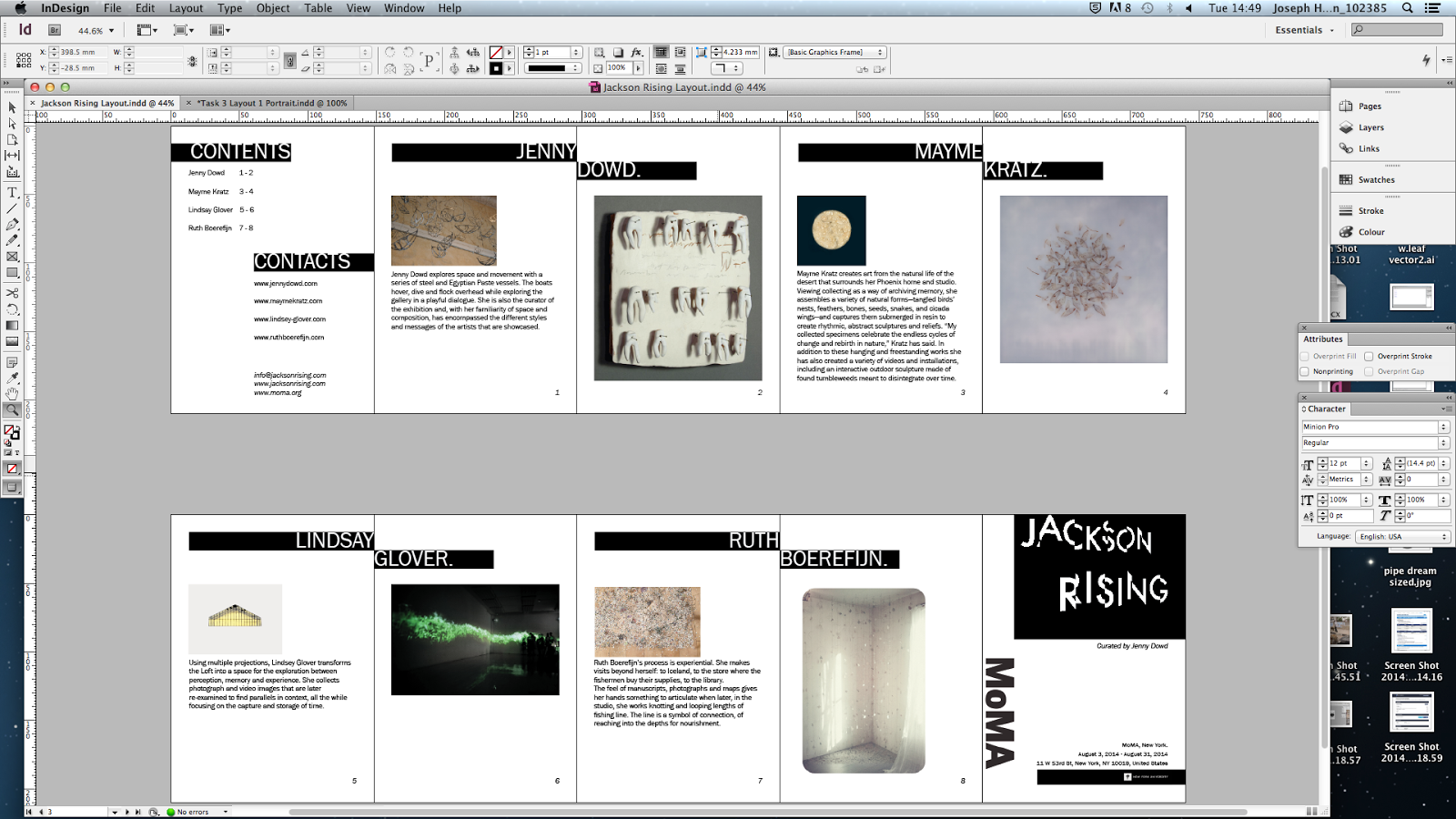
Background:
This text/image heavy
layout will ask you to utilise body copy, title, date, and location, heading,
sub heading, imagery, indexes, highlighted quotes. The amount of text allows
for the use of imagery and the type to serve as the main visual elements.
Brief:
You are to layout and design a 10-page
concertina folded brochure for a forth-coming exhibition titled ‘Jackson Rising’ at MoMA, New York. All
images, copy and branding are included. You have to create a visually
stimulating layout that showcases the artists’ imagery but does not sacrifice
important information in this process. The images and information must flow
harmoniously and offer a taste of what is to be expected during the exhibition.
Branding elements must be kept to
black and white. Images must be unaltered and in colour.
Considerations:
Headings, headlines, body copy,
grid, type, colour, image sizing, bleed, margins, flow, audience, narrative,
language, purpose, size, external print methods, preparing for print, stock, distribution.
from these considerations i went on to begin the layout. i decided to start with the front page and work out both the layout style and the aesthetic becuase then i could do the layouit for all the other pages and then add the aesthetic qualities later and have that ready for when needed.

i decided to maintain a similar style to the flyer but utilise the bleed that was on the doccument and have some design components coming off the page.

i then went on to work out the content/contact page as this would be the introduction to the rest of the leaflet. i wanted to maintain a simplicity in presentation of information as the most important thing for the leaflet is that it successfully and understandably presents the relevant information to the audience.


i found the session really useful in furthering my understanding of relevant layout and composition when designing for a job.