we had a session with fred in which we had to bring in the uppercase and lower case A and B of four different fonts; one gothic, one roman, one script and one block style.
i chose to use:
- Gothic: Skia Regular
- Roman: Times New Roman
- Block: Veranda
- Script: Edwardian Script ITC

we were to print each individual letter on a separate 10X10 square and make the point size of each font the maximum possible to fit inside the 10X10 square.
we then had to cut out and dissect each letter form into its individual anatomical parts: stem, arm, crossbar etc and lay each part on the table.
from these individual 'limbs' of each letter we were asked to create as many variations of AB/ab as we could by swapping the parts round and re-arranging them to make new letter forms.


from this we were asked to choose the 5 hybrids we thought were the most successful/aesthetically appealing/interesting.
i like the massive contrast in weights between the stems and the crossbar. i also quite like the gaps in between each part of the letter form and think the simplicity of it maintains the legibility/readability so not to over complicate the letter or make it purely about aesthetics.
i like the oriental feel to this hybrid and also its structural blockyness - it reminds me of some sort of old east asian temple in the mountains. i like how the juts from the corners of the letter mimic or hint serifs but arent really full serifs. i think this will be an interesting letter form to pursue.

i like the flow of this hybrid and how its tilt along with the single serif at the top give it a strong forward movement. i think the change in weight from thin to think on the bowl gives the letter a great elegance. i think when recreating it, however, i will experiment with removing the gap between the stem and the bowl and see which looks better.

with this hybrid i, once again like the simplicity, but also the alignment and straightness of it. it looks very proper and smart, especially the chisel tip of the lower terminal of the bowl - i like how it slants away from the horisontal terminal of the stem and how the other terminal of the bowl comes to a point to contrast the rest.
i think this will be the most challenging hybrid to transform into the other letters. the different directions the bowls are facing along with the double ended serif at the top terminal of the stem are unusual atributes that may prove difficult to recreate. i do like the composition of this letter though and think it is nicely balanced.
from these chosen five we were asked to recreate the uppercase and lowercase
A B C a b c X Y Z x y z
we first had to trace the original letterforms and then, using our knowledge of typographic anatomy, realise the defining features of that letter form and design the remaining letters based on these features. the result should be a sample of a consistent and recognisable font style.
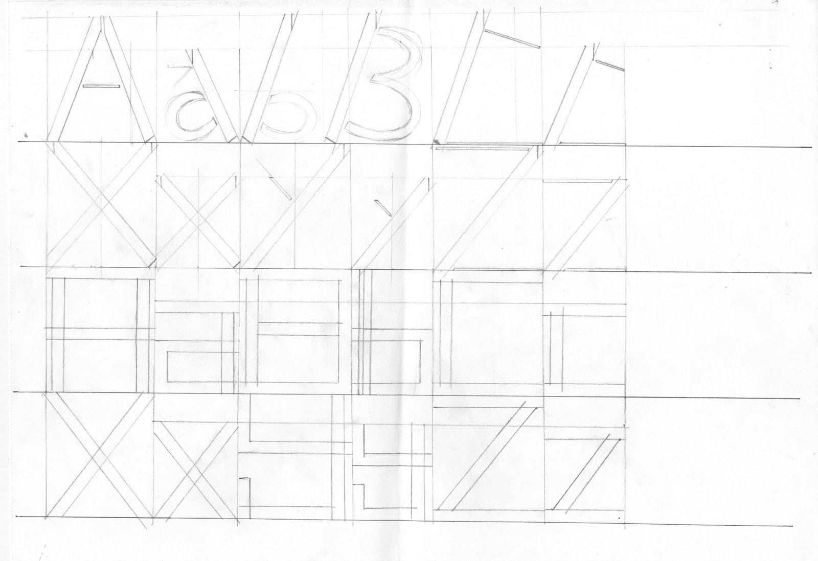


to maintain consistency and obide by typographic rules i created a grid for each letter form with a standard baseline, x height, and caps height. having designed my initial letter forms and being happy with them the next step was to trace over them all to result in clean and clear examples of the upper and lower case abcxyz for each one.
we were also asked to name each new font designed.
Clem Alice.

Powerplant.

Skywalker.

Diesel Agrio.

Girl Scout Cookies.

No comments:
Post a Comment