we were given the brief relating to the research brief in which i had to research constructivism. from our research we had to choose one topic of particular interest that we would then focus our research on. i chose to look at constructivist learning theory within and post the constructivist movement.having gathered a more focused body of research, now knowing more about constructivist learning theory, we were set the second part of the brief. this concerned the design and production of a product, in line with our specialised research topic, that somehow involved the use of info graphics and information visualisation. we had to choose one of the options of how to answer the brief. i chose to explore publication and promotion as i felt it would be the most appropriate way to design something based on the constructivist learning theory.
i wanted to make some sort of 'how to' / 'crash course' guide on the constructivist learning theory; what it entails, how it originated, how it can be used in education and the acquisition of knowledge. the problem was that the theory advocates the exploration and experience of an environment or situation in gaining new knowledge, as opposed to being taught a to b in a teacher/student format. so i decided to try and aim for the publication to inform and assist in putting people in the situation required to understand, utilise, and experience constructivist learning theory first hand.
initially, and according to my rationale, i wanted to experiment with screen printing in the production of my publication but i then decided against it, instead focussing on screen based and digitally printed design to make the zine.
i started by designing a story board layout of the basic contents of the booklet. unfortunately, the scanner didnt pick up pencil well and so some of the images are hard to make out. my main focus was to make the publication flow well in terms of text and image contents. i thought about how each page could be composed and how each topic should lead onto the next.

having thought about my initial designs i decided to experiment with logos and branding. i wanted my designs to be in line with the constructivist graphic style, so maintaining a linear composition with an exploration of geometric shape and grid layout. i thought about how the lettering could be really elongated while having some letters of drastically varying height to balance and contradict the taller letters.

i thought about what my publication should focus on and how it should be presented. i want to inform people about the constructivist educational theory and instruct them on how best to use it and what one can achieve from using it. i want to maintain a light hearted but educational tone of voice, encouraging people to try the educational theory in a way that suits them.

i continued to explore potential designs for my logo and was happy with the themed reaction to constructivism in my designs. i think the idea of the word 'theory' being joined somehow between the words 'constructivist' and 'theory' and the use of cut outs and line placement really lends itself to the constructivist theme.

having become more familiar with constructivist methods for design i felt more focussed on what sort of logo would entail such methods. i want the booklet to look like a construction in form and contents.

when i was happy with a basic design i moved on to consider how each page would look and what it would say. page 2 i wanted to be an introduction to the ideas of constructivism; the movement, a slight history, the ethos, and the introduction of the learning theory.

the first page shows a sort of time line, in construction, that contains information visualisation concerning the journey constructivism took. the triangular compositions of each section are influenced by the designs of El Lissitzky and mimic those iconic constructivist graphics. i wanted to show the progression of constructivism up to the founding of the learning theory but in an engaging and interesting way so not to bore the audience.

page 3, i felt, should bridge the gap between page 2's contents and the introduction of the application of constructivist learning theory. in this sense, i decided to make the page about the theory of constructivist learning and what it entails.

i thought about how i could demonstrate, as an info graphic, how constructivist learning theory works and how it can have success in the acquisition of knowledge. i thought about using the analogy of horse riding being a skill that can only really be developed in a practical way; in the field. you cant really learn about horse riding to a successful extent in a classroom.

i decided to slightly reorganise the design of page 3 as i though some of the composition of text and image was off. the page was slightly too busy and so i decided to do a different analogy to lessen the crowdedness of the page.

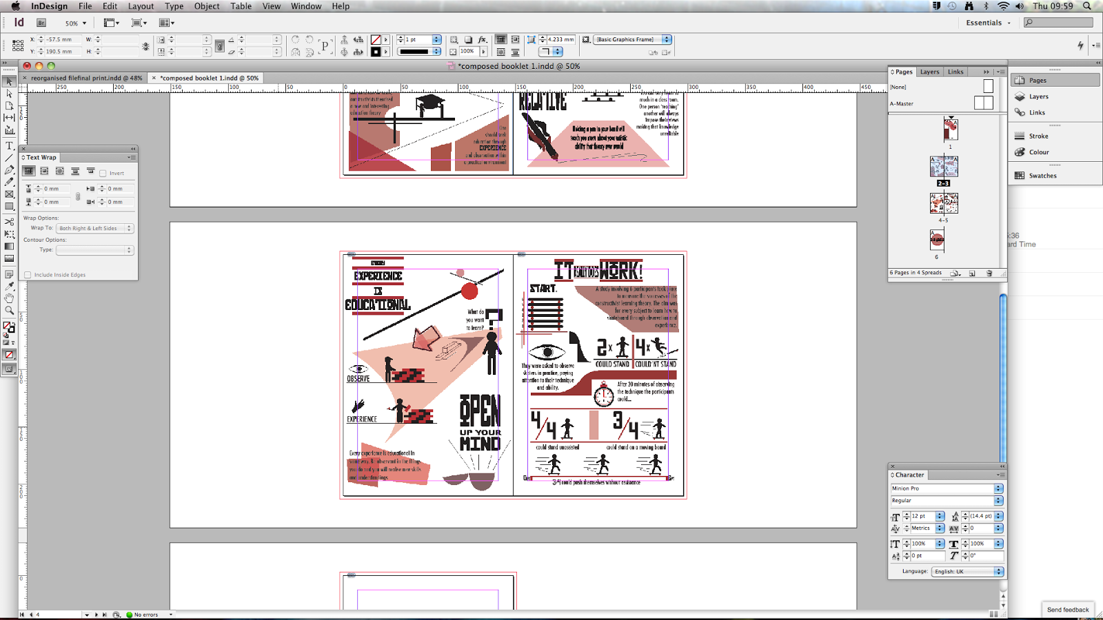
page 4, i decided, would be the main instructional page that would instruct people how to use and follow constructivist learning theory to gain successful knowledge and true learning. i didnt want this page to be a purely instructional page because that isnt in line with the theory so i decided to try and assist people in finding their own environment appropriate to their learning.

i think the analogy of brick laying is a bit random and the point may be slightly missed. i thought, still, that it would work and that it is a good representation of using the theory in the field.

in order to reassure people of the successes of the theory and so the publication has some credibility i designed page 5 around the primary research i had gathered in the previous brief surrounding the testing of the theory on subjects. i wanted to show people that it can work and include some graphic statistical representation to assist the proof/demonstration.

throughout the zine i wanted to maintain an inspiring, motivational tone of voice. making people recognise the theory for its successes and hopefully getting people to experiment with the theory itself. i thought about making the flow of this page mirror a skatepark with the ramps taking you to each next section or point of interest.

having established the basic layout and contents for each page it was time to begin the digital design of the zine. i used adobe illustrator to make the designs and text. i wanted to maintain simplicity in design and so kept to two main constraints; the use of only two typefaces throughout (Futura and Russian), and the colour scheme of black white and various shades and transparencies of red (minus the exception of a small amount of yellow on page 2).

i worked mainly with the pen and shape tools as most of the imagery was simple and easy to design and i wanted everything to be my own original designs and not from copy or web. i also work a surprising amount with the manipulation of transparency in colour which i think added another dimension to my designs.

i thought about how i could use simple shapes and constructions to effectively transfer the message or instruction as i felt that simplicity of form was in line with the constructivist ethos.

i thought a lot about what font was appropriate in what situation and developed a pattern of using futura for body copy and Russian for any slogans or words of particular significance. i also explored the composition of titles and other bodies of text, using separation lines and changing direction, to complement other constructivist design styles.

i think some of the pages may seem a bit over crowded but i made sure to maintain a significant amount of negative space and the black and red on white really lends a hand in bringing out that space so as not to make the designs look over crowded.


having designed each page how i wanted, and being happy with each page, how it looked, how it read, how it might be interpreted, i then put each design into adobe Indesign to make the zine corrctly formatted to be printed.

it was really just a case of making sure each illustrator file was correct and how i wanted it to be and then using the place tool (cmd+D) to input each design into the 6 page template i had previously organised.

each page fit fine, the quality of the designs was to par, and the layout seemed fine.

when i went to do some test print runs, however, i realised some major flaws in my design, or rather the composition of the zine. having decided to do 6 pages turned out to be a mistake because to make any sort of book that can be successfully formatted to double sided print, it has to be a multiple of four pages because otherwise there are odd pages that would get missed out, or blank pages would be included. i tried to reorganise the indesign file a couple of times but each time the same problems occurred. i knew that it was possible to make because i had done a prototype in line with how i wanted to make it. the problem was that in terms of print, this format wouldnt work.

i reorganised the indesign file in a way that would avoid the problem but it meant printing single sided and the constructing the zine mysefl, which i didnt mind as it adds a constructivist feel to it, being that i made it.
what i did was on the first page (above) i put the first and last page adjacent to each other. then i put the second and third together, and the fourth and fifth together and then would sandwich the middle pages within the outside 2 pages and stick the backs of each page to each other in a W shape.


this proved successful and my printed final zine came out really nice and then i just constructed it in the studio.
below is an example of each page


this is the zine itself and how the audience would interact with it.


overall i am happy with how my final product came out. my work effort in the first couple of weeks was heavily lacking and i didnt feel motivated or inspired to pursue the brief with any major commitment. i was stuck for ideas and couldnt come up with anything i really felt was appropriate or that i liked. i think this was the major flaw in my answering this brief. we had a massive amount of time in which to consider and produce a product in answer to the brief and i know that if i was more committed i could have done wholly better if i had worked steadily from the get go. i would have likely been able to pursue my original idea of using screen printing in my answer. having said this, once i got to grips with what i wanted to do and began designing my pages, i felt really comfortable with just getting on an the ideas came to really easily and fully formed. i think having done a lot of research surrounding the topic and really getting to grips with the theory itself was a massive help. it enabled me to just get on with the designing as i already knew the contents. from this point and up to the final print, minus the small mishap with indesign and the layout of the zine, i was really focussed and motivated and i think it does show in my final product. its just a shame that if i had committed like this from the start it could have been ten times better. in the end i was happy with my outcomes and feel that they successfully answered the brief in a way that complemented constructivist learning theory appropriately.
No comments:
Post a Comment