Consider what roles you will be allocating and also consider the time you have on this project.
1. As part of this task, you will have to digitally create a ‘Brand Guideline’ or ‘Brand Style Guide’ to articulate the driving force behind your brand. This will create the structure that you will build from, to and within. Decide what you have to design first in order to build your brand. This will include, but not limited to:
Concept – Overarching concept, how does this define and focus the brand?
Logo & application – How to use the logo & how not to.
Typography - Font choices, Point sizes, Hierarchy, Number systems, leading, tracking, kerning.
Colour Selection – Linked to your concept of possible.
Layout & Grid – for differing formats and sizes.
Tone of voice
Copy
Web
2. Create a brand map / plan of application / body of work of the products and services your brand will stretch across (for example & not limited to):
Logo & application
By-lines / straplines
Product, Range and Distribution (methods, application)
Advertising
Audience
Way finding
Invoices and associated stationary
Proposals
................................................................................................................................................................
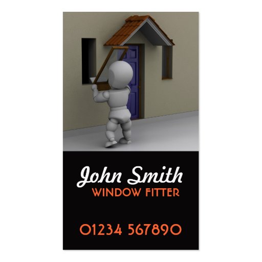
me and rinesh and danielle were put in a group and given the profession of glassier (window fitter) to brand. unfortunateful danielle couldnt make it and so it was just me and rinesh.
we began by doing some research into existing brands of the same profession.

Job Duties and Tasks for: "Glazier"
1) Cut, assemble, fit, and attach metal-framed glass enclosures for showers, bathtubs, display cases, skylights, solariums, and other structures.
2) Drive trucks to installation sites, and unload mirrors, glass equipment, and tools.
3) Fabricate and install metal sashes and moldings for glass installation, using aluminum or steel framing.
4) Install pre-assembled metal or wood frameworks for windows or doors to be fitted with glass panels, using hand tools.
5) Load and arrange glass and mirrors onto delivery trucks, using suction cups or cranes to lift glass.
6) Move furniture to clear work sites, and cover floors and furnishings with drop cloths.


having looked at a number of different businesses and their websites i recognised a basic brand identity that most followed. while there is a difference in aesthetic and colouration the basic look and layouts are pretty similar. they all look pretty horrible and dont really communicate the business, profession or company of any of them.
................................................................................................................................................................
from this we decided to go on to begin propsals for our own company brand and identity.
wqe first had to decide what sort of window fitters we are and who our target market is and what our company ethos is and what our business aims and operations are to give the brand direction and context.


from this colour scheme we went on to consider what the name and identity could be for the company. we decided to base our company in leeds and working in the yorkshire area. we wanted to make a shift from the usual identity of the sort of brands common for the market. we decided to call the comapny 'yorkshire glaze' because its relative to the are, the profession, and has a nice ring to it.
i then went on to develop some ideas for the logo. we were interested in sign painting and those sorts of aesthetics and font choices so i tried some variations of the name caligraphically. using chisel tip i explored the range of compositions possible.


me and rinesh then collaboratively developed the logo using illustrator.
i found a few fonts i thought were useable and then we both played around with sizing and layout.
following the colour scheme we considered different colour uses and extras to the logo like sheen or sparkles etc.
i then went on to develop some ideas for the logo. we were interested in sign painting and those sorts of aesthetics and font choices so i tried some variations of the name caligraphically. using chisel tip i explored the range of compositions possible.
me and rinesh then collaboratively developed the logo using illustrator.
i found a few fonts i thought were useable and then we both played around with sizing and layout.
following the colour scheme we considered different colour uses and extras to the logo like sheen or sparkles etc.

i downloaded a border and liner pack and tested a few cominations using various borders but we agreed that it made the logo look to formal and regal.

i then tried to digitally render the hand rendered claligraphy i had done but it looked quite tacky when done digitally. the stroke and flow of the letters was hard to capture in illustrator and so we decided against it.


having completed the logo i was then tasked with the website design while rinesh worked on the brand guidelines for the brand.
i wanted to maintain the aesthetic of the brand through the website and maintain a clear and minimal layout so that the user would not be confused (unlike the majority of sites in the same market that we looked at, many of which were cluttered and confusing) and so the clean aesthetic would relay our dedication to work and clean windows.


i used illustrator to mock up the layout and then digitally imposed them using photoshop.


while i did this rinesh did the brand guidelines then mocked up the presentation and we rehearsed the next day and then rpesented to the class.


http://issuu.com/joseharrisones/docs/brand_guidelines
i think the presentation went really well and we covered all the points we wanted to with confidence and clarity. we successfully considered all the relevant points and displayed them to the class with credible backing and explination.
i think the project went well overall and me and rinesh worked really well together. i think our research was strong and logo exloration was well carried out. i think the logo works well but could have been more professionally rendered and with more consideration for aesthetic and professional communication. we both delivered in terms of deliverables and produced a well rounded and presented presentation. being that we had a day time limit i feel as though we produced quite a lot of work but having seen some other peoples projects i think we could have included more digital mock ups but that was more my fault because rinesh had done some and i took longer than expected on the website design. overall i am happy with our conduct on the project and feel as though i learned a lot about brand development and guidelines, along with suprising myself with waht could be achieved in a short space of time.
No comments:
Post a Comment